8 Elements of Graphic Design for Your Creative Toolkit
In the dynamic landscape of graphic design, mastering the essentials is like having a well-stocked toolkit. Each element, from line to color, plays a pivotal role in crafting visually compelling narratives. These components aren’t mere decorative aspects; they are the building blocks of effective design. Imagine trying to build a house without the proper tools – it’s a recipe for chaos.
Graphic Design Elements
Similarly, understanding and utilizing these elements can elevate your work, transforming ideas into striking visual realities. As we explore the eight critical elements, you’ll discover how they interact, complement each other, and enhance your designs. Are you ready to dive in? Let’s unlock the full potential of your creative toolkit.
1. Line
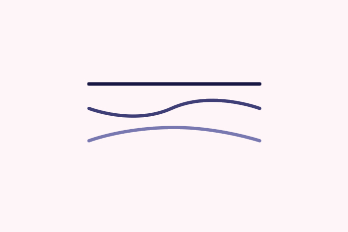
Lines might seem simple, but they’re powerful element of graphic design. Think of them as the skeleton of your design, providing structure and guiding the viewer’s eye. Lines can be straight, curved, thick, or thin, and each type has a different effect.
Straight lines are like the backbone of your design, giving it stability and order. Horizontal lines can create a sense of calm and tranquility, while vertical lines add strength and energy. Diagonal lines, on the other hand, inject movement and dynamism, making the design feel more active and alive.
Curved lines bring a sense of fluidity and grace. They can make a design feel more organic and natural. Imagine a logo with soft, flowing curves – it instantly feels more approachable and friendly.
Thickness matters too. Thick lines grab attention and convey importance, while thin lines are more delicate and can add subtle detail. Using a mix of line types and thicknesses can create a balanced and engaging design.
Lines can also be used to separate content, create patterns, and form shapes. They’re versatile and essential in creating visual hierarchy and directing the viewer’s focus.
2. Shape
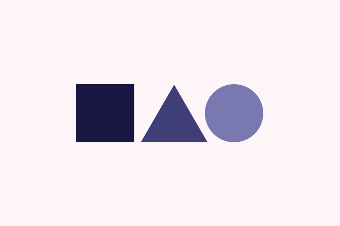
Shapes are the building blocks of graphic design, bringing form and structure to your creations. From the basic to the complex, shapes define spaces and create patterns, making your design visually interesting and engaging.
Geometric shapes, like squares, circles, and triangles, are precise and mathematical. They bring a sense of order and stability. Squares and rectangles suggest reliability and honesty, often used in logos and layouts for their straightforwardness. Circles, with no beginning or end, symbolize unity and eternity, while triangles, depending on their orientation, can convey direction, movement, or strength.
Organic shapes are more freeform and natural, mimicking the curves found in nature. They’re less predictable and more spontaneous, bringing a sense of whimsy and creativity. These shapes can make a design feel more approachable and human.
Abstract shapes are stylized and simplified forms that represent ideas rather than actual objects. They can add a layer of meaning and interpretation to your design, making it more thought-provoking.
Understanding the “Symbolism of Shapes” is key to effective design. Shapes aren’t just fillers; they communicate messages and emotions, guiding the viewer’s perception. For example, combining sharp angles with soft curves can create tension and contrast, leading the viewer’s eye and creating visual interest.
Shapes are everywhere, from logos to layout elements. Mastering their use can elevate your designs, making them more effective and visually appealing. Remember, each shape carries its own set of connotations and can significantly impact the overall feel of your work.
3. Color
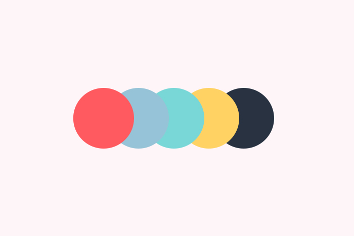
Color is the spice in the recipe of graphic design, bringing flavor and mood to every project. It’s not just about looking good; colors have the power to evoke emotions and influence behavior.
Think of red. It’s bold, intense, and grabs attention. That’s why it’s used for warnings and sales. It can evoke feelings of urgency or excitement. Blue, in contrast, is calming and trustworthy, often chosen by banks and tech companies to foster a sense of reliability.
The “psychology of colors” is fascinating. Yellow, for instance, is cheerful and energetic, like a burst of sunshine, making it great for drawing attention or creating a warm feeling. Green, synonymous with nature, symbolizes growth and health, perfect for eco-friendly or wellness brands.
Even black and white play vital roles. Black is powerful and elegant, adding sophistication, while white represents purity and simplicity, providing a clean backdrop.
Choosing the right color palette can transform a design from bland to brilliant. It’s about finding the perfect mix to convey the desired message and evoke the right emotions. With the right colors, you can guide users, highlight key elements, and create a cohesive, engaging experience. Color isn’t just decoration; it’s a crucial part of visual communication.
4. Texture
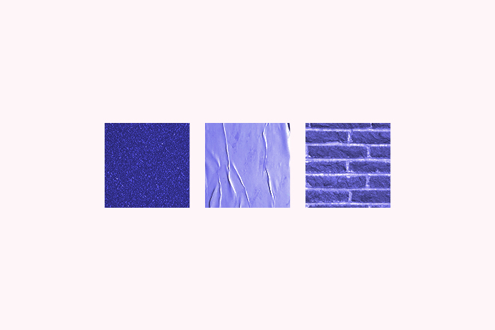
Texture adds depth and dimension to graphic design, making it feel more tangible and real. It’s like adding spices to a dish – it enhances the flavor and complexity. Texture can be visual, where it appears like a specific surface (like wood or metal), or tactile, where you can actually feel the surface.
Using texture effectively can make a design more engaging and interesting. For instance, a website background with a subtle paper texture can give a vintage, handcrafted feel. On the other hand, a glossy, metallic texture can make a design feel modern and sleek.
Texture is all about adding layers and richness. Even in minimalist designs, a bit of texture can go a long way in adding personality.
Remember, the key is balance. Too much texture can overwhelm, while too little can leave your design flat. It’s about finding that sweet spot to enhance your visual storytelling.
5. Space
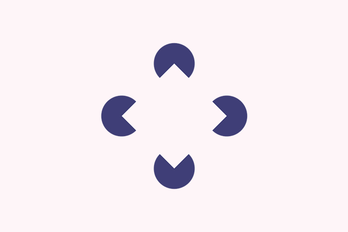
Space, often called white space or negative space, is the silent hero of in the elements of graphic design. It’s the area between elements in a composition. Think of it as the breath of fresh air in your layout.
Proper use of space can make your design look clean and organized. It helps to avoid clutter and improves readability. For instance, generous spacing between text lines and paragraphs can make your content easier to read.
Space also guides the viewer’s eye. By strategically placing elements and leaving enough space around them, you can direct attention to key areas. This creates a visual hierarchy, making your design more effective.
In minimalist designs, space is used generously to focus on the essential elements. It adds elegance and sophistication. Remember, space isn’t empty; it’s a powerful tool to enhance your design’s impact.
6. Typography
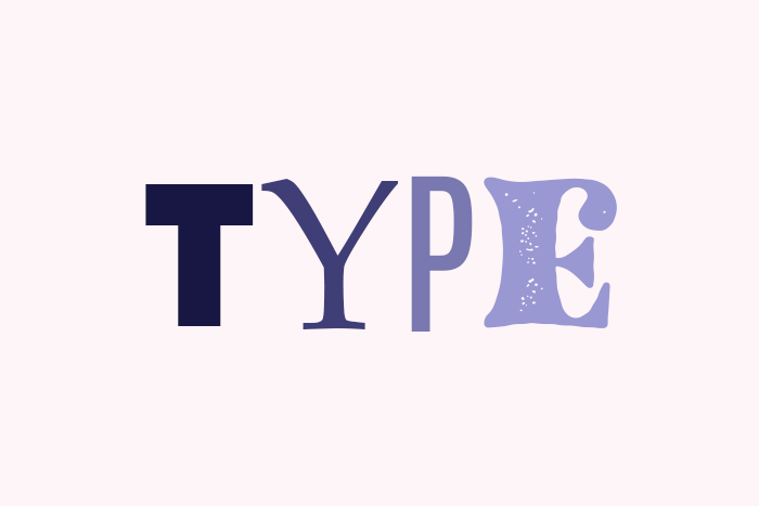
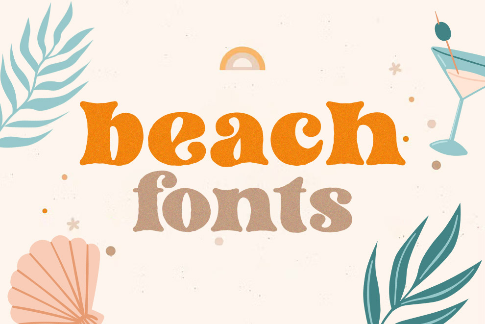
Typography is the art of arranging text, making it both legible and visually appealing. It’s more than just picking fonts; it’s about creating harmony between text and other design elements. Good typography enhances readability and conveys the right mood.
Choosing the right font is crucial. Serif fonts, like Times New Roman, have small lines at the ends of characters and convey tradition and reliability. Sans-serif fonts, like Arial, are clean and modern, often used for digital content. Script fonts mimic handwriting, adding a touch of elegance or playfulness.
Hierarchy is essential in typography. It helps to guide the reader’s eye through the content. Headlines are usually larger and bolder, while body text is smaller and simpler. Using different font sizes, weights, and styles can create a visual hierarchy, making your design more effective.
Spacing is another key element. Proper use of line height (leading), space between letters (kerning), and space between words (tracking) can improve readability and give your design a polished look. Too much or too little space can make text hard to read and unappealing.
Typography also involves color. Choosing the right color can enhance the text’s readability and impact. High contrast between text and background improves readability, while complementary colors can make the design more cohesive.
Finally, don’t forget alignment. Left-aligned text is easiest to read, while centered or right-aligned text can be used for special effects. Consistent alignment helps to create a clean and organized design.
7. Form
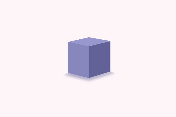
Form in graphic design is about creating the illusion of three-dimensionality on a two-dimensional surface. It adds depth and volume, making elements appear more lifelike and tangible. Forms can be geometric, like cubes and spheres, or organic, like the shapes of trees and animals.
By using shading, gradients, and perspective, you can make forms pop off the page. For instance, a simple circle can be transformed into a sphere with the right shadow and highlight, giving it a 3D effect.
Form is crucial in conveying realism. It’s what makes a drawing of an apple look like you could reach out and pick it up. In digital design, 3D forms are often used in icons, illustrations, and user interfaces to add a touch of realism and engage users.
Understanding form allows designers to create more dynamic and interesting compositions, bridging the gap between flat design and lifelike visuals. It’s all about manipulating shapes to give them depth and dimension, making your designs more immersive and engaging.
8. Imagery
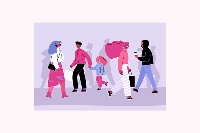
Photographs, illustrations, and icons are common types of imagery. Each serves a different purpose. Photos can add realism and human connection, while illustrations offer more flexibility and creativity. Icons are great for simplifying complex information and enhancing user experience.
Choosing the right imagery is crucial. High-quality, relevant images can elevate a design, while poor choices can detract from its effectiveness. It’s about matching the image to the message.
Imagery also plays a vital role in branding. Consistent use of style and color in images helps to create a cohesive brand identity. Whether it’s sleek and modern or warm and vintage, the imagery should reflect the brand’s personality.
Moreover, consider the context. Images should enhance the message, not distract from it. They should be strategically placed to guide the viewer’s eye and complement the text.
Incorporating imagery thoughtfully can make your design more engaging, memorable, and impactful. It’s the element that can turn a good design into a great one.
There you go, that’s all the elements of graphic design which you can use in creating meaningful projects.
Conclusion
Mastering these essential graphic design elements will elevate your work and ensure your designs are both aesthetically pleasing and effective. From understanding color theory to creating balance and consistency, each component plays a vital role in the design process. Ready to take your design skills to the next level? Start incorporating these elements into your projects today and watch your designs transform!

